
Transform your research with captivating data visualizations! Check out our hand-picked selection of the best tools for researchers.
Data visualization is a crucial aspect of research as it helps in presenting complex data in a more digestible form. It not only aids researchers in understanding their data better but also makes it easier for them to communicate their findings to others.
With the advancement of technology, there are now numerous data visualization tools available in the market, each with its own set of features and capabilities.
From open-source tools to paid ones, this list covers a range of options to cater to the diverse needs of researchers.
Some tools are more suited for scientific data visualization, while others are ideal for creating interactive and appealing visualizations for business purposes.
It’s important to note that the choice of the best tool depends on the specific requirements and goals of the researcher. Some tools may be more suited for data analysis, while others might be better for creating stunning visualizations.
Hence, the list of best data visualization tools is not necessarily a ranking but rather a guide to help researchers make informed decisions on the tool that best suits their needs.
Table of Contents
2 Top Bar Graphs and Charts Tools For Researchers
Matplotlib – Create Static, Animated, and Interactive Visualizations
Matplotlib is a widely used Python library for data visualization that offers a range of customization options and a large community of users.
It has a relatively steep learning curve compared to some other visualization tools, but once users are familiar with it, they can create complex and highly customized visualizations.
Matplotlib is well-suited for researchers who need to create visualizations with a high degree of control and customization, but may not be the best choice for those looking for a more user-friendly tool.
Overall, Matplotlib provides a rich and flexible environment for data visualization, making it a popular choice for researchers and data scientists.
Availability: A web-based app that runs on Android or iOS devices.
👍Pros
- Widely used and well-established in the data visualization community
- Highly customizable and flexible, allowing users to create complex and detailed visualizations
- Supports a wide range of visualization types, including line graphs, scatter plots, heat maps, and 3D visualizations
- Free and open-source, making it accessible to anyone
- Has a large community of users, making it easy to find support and resources online
👎Cons
- Steep learning curve, which can make it difficult for beginners to get started
- Limited interactivity compared to some other visualization tools
- Can be challenging to create complex visualizations, especially for users who are not familiar with programming
💸Pricing
- Matplotlib is free and open-source software
Ggplot2 – Improve The Quality And Aesthetics Of Your Graphics
ggplot2 is a data visualization package for the R programming language that is designed for creating custom and highly detailed visualizations. It has a strong focus on grammar of graphics, which allows users to create complex visualizations by combining simple building blocks.
ggplot2 is highly customizable and offers a wide range of visualization types, including line graphs, scatter plots, and bar charts. It is well-suited for researchers who need to create detailed visualizations and who are familiar with the R programming language.
However, ggplot2 can be challenging to learn for beginners and may not be the best choice for those who are looking for a more user-friendly tool. Overall, ggplot2 provides a powerful and flexible environment for data visualization, making it a popular choice for researchers and data scientists who work with R.
Availability: A web-based app that runs on Android or iOS devices.
👍Pros
- Strong focus on the grammar of graphics, which allows for the creation of complex and highly detailed visualizations
- Wide range of visualization types, including line graphs, scatter plots, and bar charts
- Highly customizable and flexible, allowing users to create visualizations that match their specific needs
- Well-suited for researchers who are familiar with the R programming language
- Large community of users, making it easy to find support and resources online
👎Cons
- Steep learning curve, which can make it difficult for beginners to get started
- Limited to the R programming language, which may not be suitable for everyone
- Can be challenging to create complex visualizations, especially for users who are not familiar with programming
💸Pricing
- ggplot2 is free and open-source software
2 Best Line Graphs Tools For Data Analysis
Seaborn – Draw Attractive And Informative Statistical Data
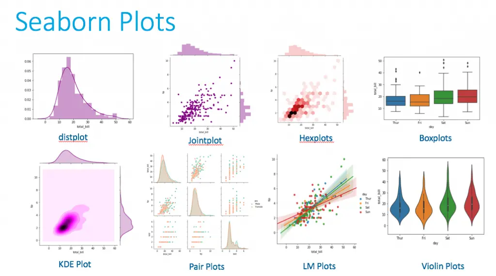
Seaborn is a Python library for data visualization that is designed to be user-friendly and intuitive. It is built on top of Matplotlib and provides a high-level interface for creating common types of visualizations, such as line graphs, scatter plots, and bar charts.
Seaborn has a number of built-in themes and color palettes that make it easy to create visually appealing visualizations with minimal effort.
It also provides functions for statistical plotting, such as regression plots and distribution plots, making it well-suited for researchers who need to visualize complex data relationships.
Overall, Seaborn provides a convenient and accessible way to create visualizations in Python, making it a popular choice for researchers and data scientists who want a more user-friendly tool.
Availability: A web-based app that runs on Android or iOS devices.
👍Pros
- User-friendly and intuitive interface, making it easier to get started with data visualization
- Built on top of Matplotlib, providing access to a wide range of visualization types
- Built-in themes and color palettes, making it easy to create visually appealing visualizations
- Statistical plotting functions, such as regression plots and distribution plots, for visualizing complex data relationships
- Widely used and well-supported by the data science and research community
👎Cons
- May be less flexible than other visualization libraries, such as Matplotlib or ggplot2
- May not be suitable for more complex or specialized visualizations
- May be less performant than other libraries for large or complex data sets
💸Pricing
- Seaborn is free and open-source software
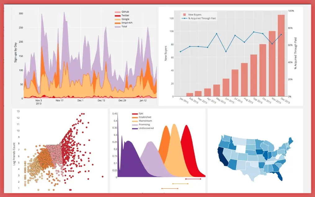
Plotly – Enabling Data-Driven Decisions Via Data Apps
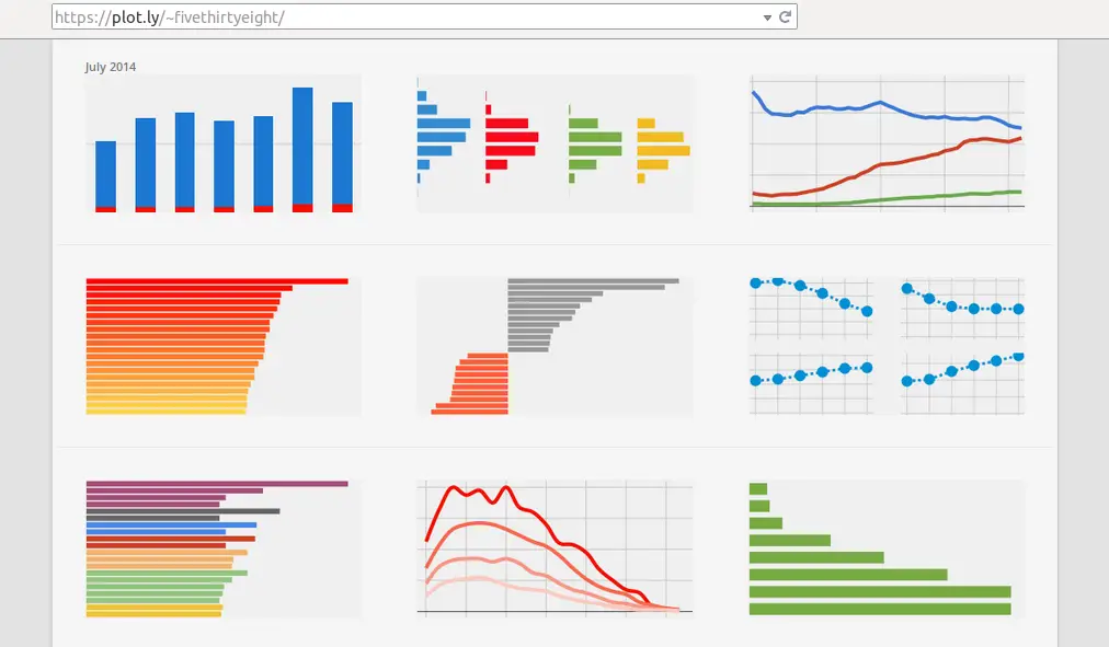
Plotly is a data visualization library that provides an interactive user experience. With Plotly, users can create a wide range of visualizations, including line graphs, scatter plots, bar charts, and more.
The library is known for its ability to create interactive data visualizations that allow users to zoom in, pan, and hover over data points to see more information.
Plotly also provides a web-based platform for creating visualizations, which allows users to collaborate on projects and share their work with others. The platform provides a wide range of customization options, including the ability to add annotations, change the appearance of visualizations, and more.
Overall, Plotly provides a powerful and flexible tool for creating interactive visualizations, making it well-suited for researchers and data scientists who need to share their work with others.
Availability: A web-based app that runs on Android or iOS devices.
👍Pros
- Provides interactive visualizations, allowing users to zoom in, pan, and hover over data points
- Wide range of visualization types, including line graphs, scatter plots, bar charts, and more
- Web-based platform for creating visualizations, making it easy to collaborate and share work
- Customization options, including the ability to add annotations and change the appearance of visualizations
- Strong support for real-time data streaming and updating of visualizations
👎Cons
- Steep learning curve, which can make it difficult for beginners to get started
- May have performance issues for very large or complex data sets
- Proprietary software, which may limit the ability of users to modify or redistribute the code
💸Pricing
- Basic version is free
- The price of the Premium version is not public on the official website. User can get a quote by filling the form on the website
3 Topmost Scatter Plots For Identifying Data Trends & Patterns
Bokeh – Build Beautiful Visuals
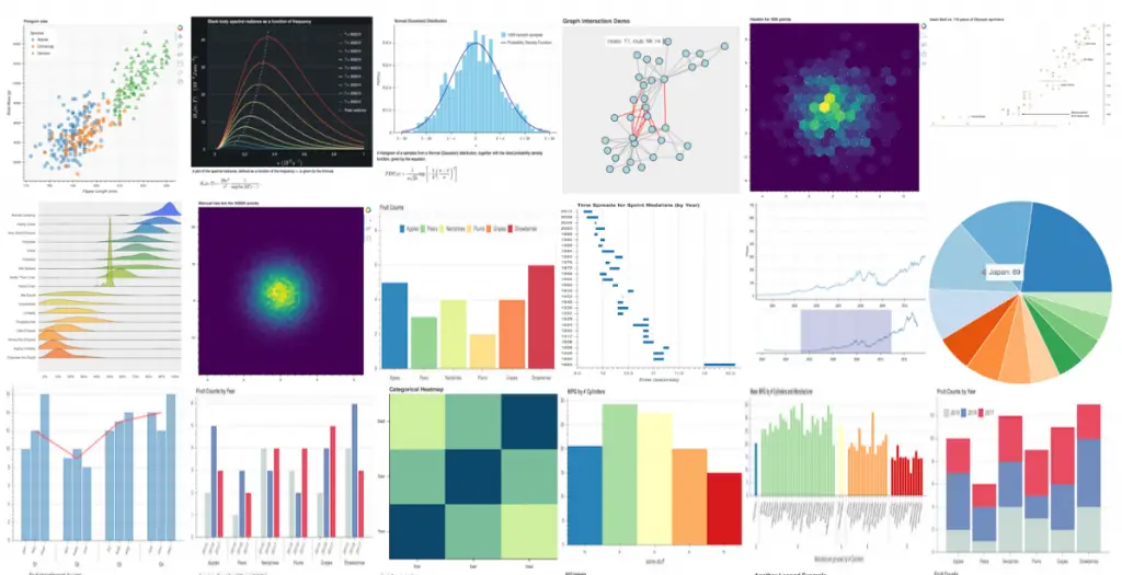
Bokeh is a Python library for creating interactive and visually appealing web-based data visualizations.
It aims to provide a clean and elegant interface for users to create interactive visualizations, dashboards and charts with ease, by allowing them to focus on the data they want to display, rather than the technical aspects of creating the visualizations.
This results in an enjoyable user experience where they can easily generate interactive visualizations and embed them in web pages or notebooks, allowing users to explore and understand their data in a dynamic and engaging way.
Availability: A web-based app that runs on Android or iOS devices.
👍Pros
- User-friendly interface
- Wide range of visualizations
- Customization options
- Integration with other tools
👎Cons
- Limited documentation: While Bokeh is a powerful tool, it can be difficult for users to get started due to limited documentation
- Complex for advanced tasks: Bokeh may not be suitable for more complex data visualization tasks or advanced data analysis workflows, as it can be difficult to use for these tasks
💸Pricing
- Bokeh is open-source software, which means that it is available for free to use and modify
Vega-Lite – A High-Level Grammar of Interactive Graphics
Vega-Lite is a high-level grammar of interactive graphics for data visualization. It aims to provide a simple and intuitive interface for creating interactive visualizations, by allowing users to describe the visual encoding of their data using a concise syntax.
The end result is an interactive visualization that can be easily embedded in web pages or Jupyter notebooks, providing an enjoyable user experience where users can explore and understand their data in a dynamic and engaging way.
Vega-Lite abstracts many of the technical details of creating visualizations, allowing users to focus on their data and the story they want to tell, rather than the underlying technology.
Availability: A web-based app that runs on Android or iOS devices.
👍Pros
- User-friendly interface: Vega-Lite provides a simple and intuitive interface for creating interactive visualizations, making it easy for users to get started with data visualization
- Wide range of visualizations: Vega-Lite supports a wide range of visualization types, including bar charts, scatter plots, line graphs, and more, making it ideal for a wide range of data visualization tasks
- Customization options: Vega-Lite allows users to customize their visualizations in many ways, including customizing the appearance, adding interactions, and linking visualizations to data sources
- Integration with other tools: Vega-Lite integrates well with other tools, including Jupyter Notebook and Vega, making it easy to integrate visualizations into web applications and other data analysis workflows
👎Cons
- Limited documentation: While Vega-Lite is a powerful tool, it can be difficult for users to get started due to limited documentation
- Complex for advanced tasks: Vega-Lite may not be suitable for more complex data visualization tasks or advanced data analysis workflows, as it can be difficult to use for these tasks
💸Pricing
- Vega-Lite is open-source software, which means that it is available for free
Highcharts – Create Reliable And Secure Data Visualizations
Highcharts is a popular JavaScript library for creating interactive data visualizations. It provides a user-friendly interface for creating high-quality charts and graphs, with a wide range of visualization types including bar charts, line graphs, pie charts, and more.
Highcharts is designed to be easy to use, with a clean and intuitive API, making it a great choice for users of all skill levels.
The visualizations created with Highcharts are highly interactive, with features such as zooming, panning, and tooltips, allowing users to explore and understand their data in a dynamic and engaging way.
With Highcharts, users can easily create beautiful and interactive visualizations that can be embedded in web pages, providing an enjoyable and informative user experience.
Availability: A web-based app that runs on Android or iOS devices.
👍Pros
- User-friendly interface: Highcharts provides a clean and intuitive interface for creating high-quality data visualizations, making it easy for users to get started with data visualization
- Wide range of visualizations: Highcharts supports a wide range of visualization types, including bar charts, line graphs, pie charts, and more, making it ideal for a wide range of data visualization tasks
- Customization options: Highcharts allows users to customize their visualizations in many ways, including customizing the appearance, adding interactions, and linking visualizations to data sources
- High performance: Highcharts is optimized for performance, allowing users to create visualizations that can handle large datasets and complex interactions with ease
👎Cons
- Steep learning curve: While Highcharts provides a user-friendly interface, it may have a steep learning curve for users who are new to data visualization and JavaScript
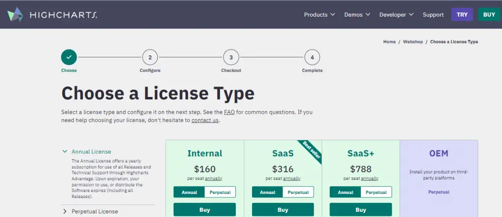
- Limited free options: Highcharts provides a free trial for users to test the library, but users will need to purchase a license for commercial use or for more advanced features
💸Pricing
- Highcharts offers several pricing plans for commercial use, ranging from individual licenses to enterprise-level solutions
- The pricing plans for licenses are as follow:
- Internal: $160/seat/year
- SaaS: $316/seat/year
- SaaS+: $788/seat/year
2 Prime Heat Maps Tools For Data Representation
Chart.js – Simple And Flexible Charting
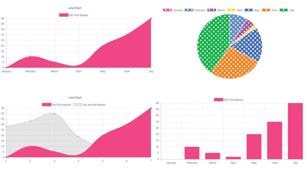
Chart.js is a popular open-source JavaScript library for creating data visualizations. It provides a user-friendly interface for creating simple and complex charts and graphs, including bar charts, line graphs, pie charts, and more.
Chart.js is designed to be easy to use, with a simple API and plenty of documentation, making it a great choice for users of all skill levels.
The visualizations created with Chart.js are highly interactive, with features such as zooming, panning, and tooltips, allowing users to explore and understand their data in a dynamic and engaging way.
With Chart.js, users can easily create beautiful and interactive visualizations that can be embedded in web pages, providing an enjoyable and informative user experience.
Availability: A web-based app that runs on Android or iOS devices.
👍Pros
- Open-source: Chart.js is open-source software, meaning that it is free to use and modify
- User-friendly interface: Chart.js provides a simple and intuitive interface for creating high-quality data visualizations, making it easy for users to get started with data visualization
- Wide range of visualizations: Chart.js supports a wide range of visualization types, including bar charts, line graphs, pie charts, and more, making it ideal for a wide range of data visualization tasks
- High performance: Chart.js is optimized for performance, allowing users to create visualizations that can handle large datasets and complex interactions with ease
👎Cons
- Limited customization options: While Chart.js provides a simple and intuitive interface, it may not be suitable for users who need more advanced customization options for their visualizations
- Limited documentation: While Chart.js has a simple API and plenty of documentation, it can be difficult for users to find answers to more complex questions or problems they encounter while using the library
💸Pricing
- Chart.js is open-source software, which means that it is available for free to use and modify
Google Charts – Creates Graphical Charts From User-Supplied Information
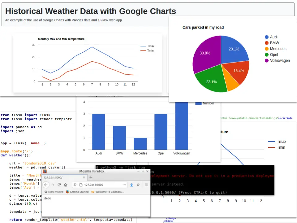
Google Charts is a free, powerful, and user-friendly tool to create data visualizations. It is a web-based library of charts and graphs that allows users to easily create and customize a wide range of visualization types, including bar charts, line graphs, pie charts, and more.
Google Charts is designed to be simple to use, with a clean and intuitive interface that makes it easy for users of all skill levels to get started.
The visualizations created with Google Charts are highly interactive, with features such as zooming, panning, and tooltips, allowing users to explore and understand their data in a dynamic and engaging way.
With Google Charts, users can create beautiful and informative visualizations that can be easily embedded in web pages, providing an enjoyable and informative user experience.
Availability: A web-based app that runs on Android or iOS devices.
👍Pros
- Free: Google Charts is a free service, making it accessible to a wide range of users and organizations
- User-friendly interface: Google Charts provides a simple and intuitive interface for creating high-quality data visualizations, making it easy for users to get started with data visualization
- Wide range of visualizations: Google Charts supports a wide range of visualization types, including bar charts, line graphs, pie charts, and more, making it ideal for a wide range of data visualization tasks
- High performance: Google Charts is optimized for performance, allowing users to create visualizations that can handle large datasets and complex interactions with ease
👎Cons
- Limited customization options: While Google Charts provides a simple and intuitive interface, it may not be suitable for users who need more advanced customization options for their visualizations
- Dependence on internet connection: Google Charts is a web-based service, meaning that users must have an internet connection to use it
💸Pricing
- Google Charts is a free service provided by Google
3 Finest Map Visualizations For Representing Geographical Data
Kepler – Scale Large Data Sets
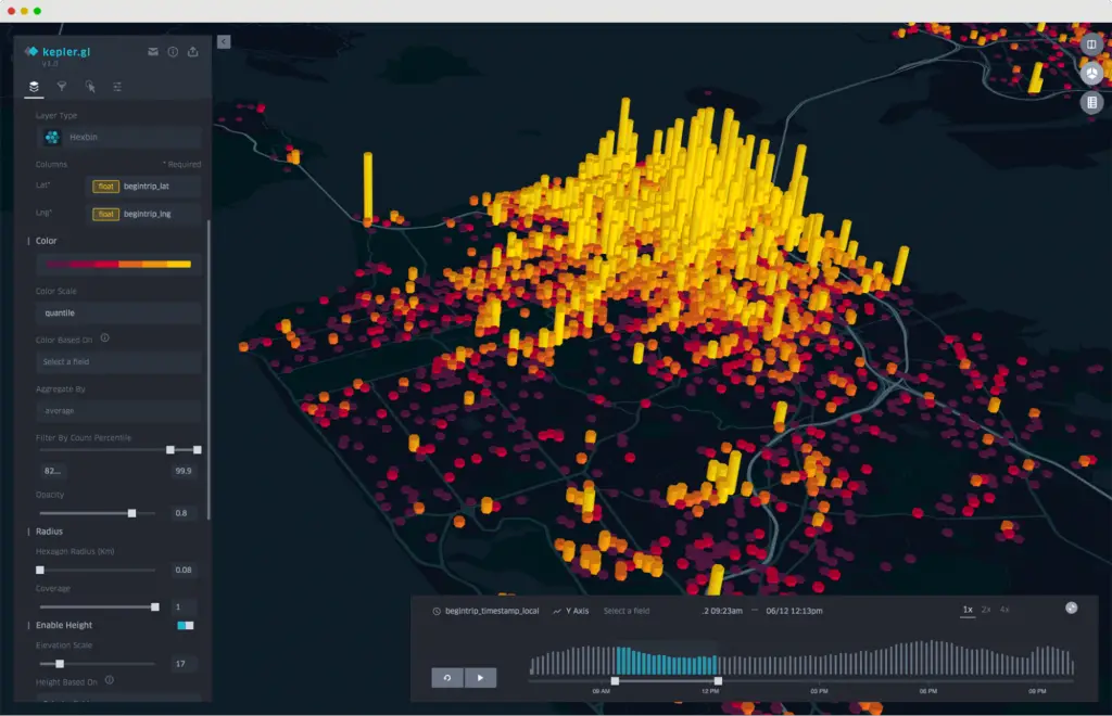
Kepler.gl is a powerful and user-friendly open-source data visualization tool that is specifically designed for geospatial data. It provides a clean and intuitive interface for creating detailed and interactive visualizations, including maps and 3D models.
Kepler.gl is designed to be simple to use, with a simple API and plenty of documentation, making it a great choice for users of all skill levels.
The visualizations created with Kepler.gl are highly interactive, with features such as zooming, panning, and tooltips, allowing users to explore and understand their data in a dynamic and engaging way.
With Kepler.gl, users can create beautiful and informative visualizations that can be embedded in web pages, providing an enjoyable and informative user experience for geospatial data analysis.
Availability: A web-based app that runs on Android or iOS devices.
👍Pros
- Open-source: Kepler.gl is open-source software, meaning that it is free to use and modify
- User-friendly interface: Kepler.gl provides a simple and intuitive interface for creating high-quality data visualizations, making it easy for users to get started with data visualization
- Specialized for geospatial data: Kepler.gl is specifically designed for geospatial data, providing advanced visualization and analysis tools for this type of data
- High performance: Kepler.gl is optimized for performance, allowing users to create visualizations that can handle large datasets and complex interactions with ease
👎Cons
- Limited to geospatial data: While Kepler.gl is specifically designed for geospatial data, it may not be suitable for users who need to visualize non-geospatial data
- Limited customization options: While Kepler.gl provides a simple and intuitive interface, it may not be suitable for users who need more advanced customization options for their visualizations
💸Pricing
- Kepler.gl is open-source software, which means that it is available for free to use
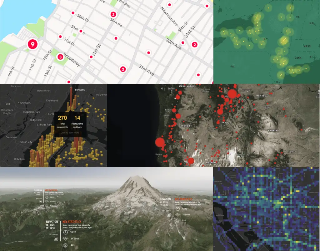
OpenLayers – Generate Interactive Maps
OpenLayers is an open-source JavaScript library for building interactive maps and visualizations. It provides a clean and intuitive API for creating dynamic and engaging maps, with features such as zooming, panning, and tooltips.
OpenLayers is designed to be simple to use, with clear documentation and a wide range of examples, making it a great choice for users of all skill levels.
The maps created with OpenLayers are highly interactive and can be customized to meet the needs of each user, including the addition of custom markers, overlays, and styles.
With OpenLayers, users can create beautiful and informative maps that can be embedded in web pages, providing an enjoyable and informative user experience for mapping and geospatial data analysis.
Availability: A web-based app that runs on Android or iOS devices.
👍Pros
- Open-source: OpenLayers is open-source software, meaning that it is free to use and modify
- User-friendly API: OpenLayers provides a simple and intuitive API for creating dynamic and engaging maps, making it easy for users to get started with mapping and geospatial data analysis
- Wide range of examples: OpenLayers has a wide range of examples and documentation, making it a great choice for users of all skill levels
- High performance: OpenLayers is optimized for performance, allowing users to create maps that can handle large datasets and complex interactions with ease
👎Cons
- Limited customization options: While OpenLayers provides a simple and intuitive API, it may not be suitable for users who need more advanced customization options for their maps
- Steep learning curve: While OpenLayers has a wide range of examples and documentation, it may have a steep learning curve for users who are new to mapping and geospatial data analysis
💸Pricing
- OpenLayers is open-source software, which means that it is available for free to use
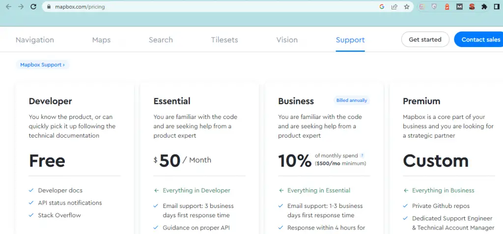
Mapbox – Control Your Design
Mapbox is a cloud-based platform for building and using custom maps. It provides a user-friendly interface for creating beautiful and interactive maps, with features such as zooming, panning, and custom markers.
Mapbox offers a wide range of customization options, allowing users to fully control the look and feel of their maps. With Mapbox, users can easily add their own data and style their maps, making it a great choice for data visualization and geospatial analysis.
The maps created with Mapbox are optimized for performance, ensuring a smooth and seamless experience for end-users. Overall, Mapbox provides an enjoyable and informative user experience for mapping and geospatial data analysis.
Availability: A web-based app that runs on Android or iOS devices.
👍Pros
- User-friendly interface: Mapbox provides a user-friendly interface for creating beautiful and interactive maps, making it easy for users to get started with mapping and geospatial data analysis
- Wide range of customization options: Mapbox offers a wide range of customization options, allowing users to fully control the look and feel of their maps
- Cloud-based platform: Mapbox is a cloud-based platform, which means that users can access their maps and data from anywhere, at any time
- High performance: Mapbox is optimized for performance, ensuring a smooth and seamless experience for end-users
👎Cons
- Pricing: Mapbox can be more expensive than some other mapping platforms, especially for larger or more complex projects
- Steep learning curve: While Mapbox provides a user-friendly interface, it may have a steep learning curve for users who are new to mapping and geospatial data analysis
💸Pricing
- Basic version free
- Premium version $50/month
3 Leading Interactive Visualizations Tools For Data Interaction
Tableau – Understand Your Data
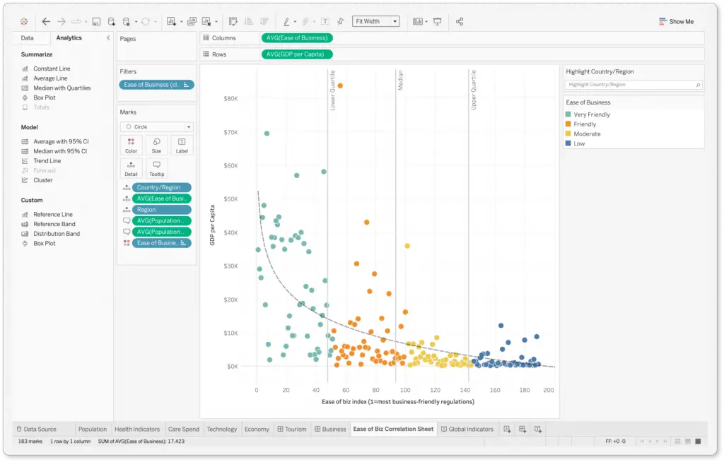
Tableau is a data visualization and business intelligence tool that provides a user-friendly interface for creating interactive and engaging dashboards and reports.
Tableau offers a wide range of visualization options, from basic bar and line charts to more advanced geospatial and statistical visualizations. The tool provides a drag-and-drop interface, allowing users to easily connect to their data sources and create dynamic and interactive dashboards.
Tableau also provides collaboration features, allowing users to share and collaborate on their data visualizations with others in real-time. Overall, Tableau provides a smooth and enjoyable user experience for data analysis and visualization.
Availability: A web-based app that runs on Android or iOS devices.
👍Pros
- User-friendly interface: Tableau provides a drag-and-drop interface, allowing users to easily connect to their data sources and create dynamic and interactive dashboards
- Wide range of visualization options: Tableau offers a wide range of visualization options, from basic bar and line charts to more advanced geospatial and statistical visualizations
- Collaboration features: Tableau provides collaboration features, allowing users to share and collaborate on their data visualizations with others in real-time
- Robust data analysis capabilities: Tableau offers robust data analysis capabilities, including advanced statistical analysis and machine learning
👎Cons
- Steep learning curve: Tableau has a steep learning curve, especially for users who are new to data visualization and business intelligence
- Pricing: Tableau can be expensive, especially for larger organizations or more complex projects
💸Pricing
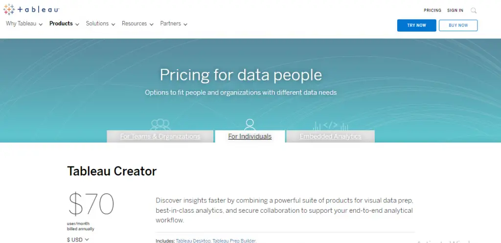
- Tableau Cloud (Hosted by Tableau) – $70 monthly for every user which is billed annually
- Tableau Server (On-Premise) – $70 monthly for every user which is billed annually
PowerBI – Get The Most Out Of Your Data
PowerBI is a business intelligence tool that provides a user-friendly interface for creating interactive and engaging dashboards and reports. PowerBI offers a wide range of visualization options, from basic bar and line charts to more advanced geospatial and statistical visualizations.
The tool provides a drag-and-drop interface, allowing users to easily connect to their data sources and create dynamic and interactive dashboards. PowerBI also provides collaboration features, allowing users to share and collaborate on their data visualizations with others in real-time.
Overall, PowerBI provides a smooth and enjoyable user experience for data analysis and visualization.
Availability: A web-based app that runs on Android or iOS devices.
👍Pros
- User-friendly interface: PowerBI provides a drag-and-drop interface, allowing users to easily connect to their data sources and create dynamic and interactive dashboards
- Wide range of visualization options: PowerBI offers a wide range of visualization options, from basic bar and line charts to more advanced geospatial and statistical visualizations
- Collaboration features: PowerBI provides collaboration features, allowing users to share and collaborate on their data visualizations with others in real-time
- Integration with Microsoft products: PowerBI integrates with other Microsoft products, such as Excel and SharePoint, providing users with a seamless experience for data analysis and visualization
👎Cons
- Steep learning curve: PowerBI has a steep learning curve, especially for users who are new to data visualization and business intelligence
- Limited data sources: PowerBI is limited in the number of data sources it can connect to, compared to other business intelligence tools
💸Pricing
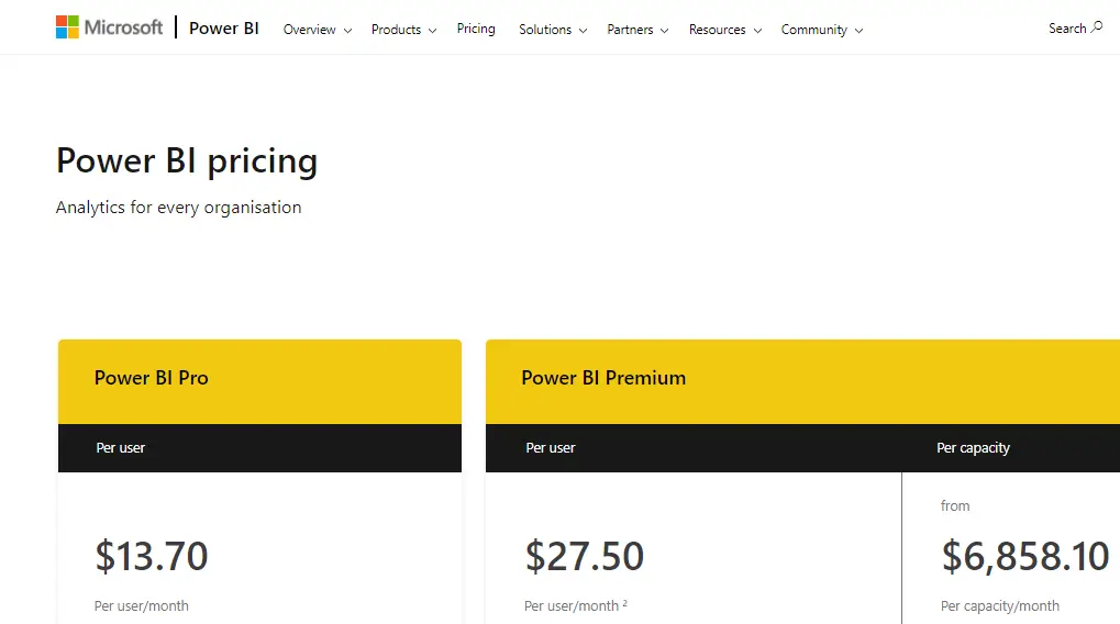
- Power BI Pro ($13.70 per user/per month)
- Power BI Premium ($27.50 per user/per month)
- Power BI Premium ($6,858.10 per capacity/per month)
MATLAB – Analyze Data, Develop Algorithms, And Create Models
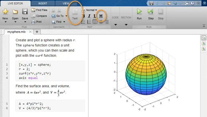
MATLAB is a technical computing software that provides a user-friendly interface for solving complex mathematical problems and generating high-quality visualizations.
It offers a wide range of toolboxes and functions for data analysis, modeling, simulation, and visualization. With its easy-to-learn syntax and powerful functions, MATLAB enables users to perform complex calculations and analyze data with just a few lines of code.
Additionally, it has an extensive library of pre-built functions and interactive tools that make it accessible to a wide range of users, from engineers and scientists to students and hobbyists.
The software also offers a seamless integration with other programming languages and tools, making it a versatile platform for data analysis and visualization.
Availability: A web-based app that runs on Android or iOS devices.
👍Pros
- User-friendly interface and easy-to-learn syntax
- Wide range of toolboxes and functions for data analysis, modeling, simulation, and visualization
- Pre-built functions and interactive tools for a wide range of applications
- Seamless integration with other programming languages and tools
- Widely used in industry and academia for scientific and engineering applications
👎Cons
- Steep learning curve for some advanced features
- High cost for individual users, especially for commercial use
- Limited support for open-source technologies and languages
- Performance limitations for large-scale data analysis and modeling
💸Pricing
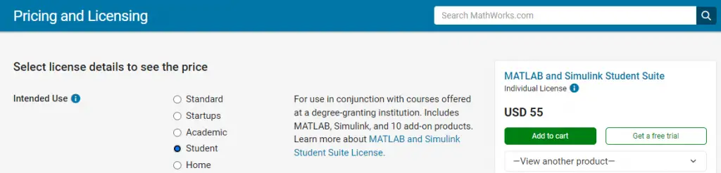
- Student version – $49/student
- Home version – $149/perpetual license
- Education version – $250/year
- Standard version – $860/year
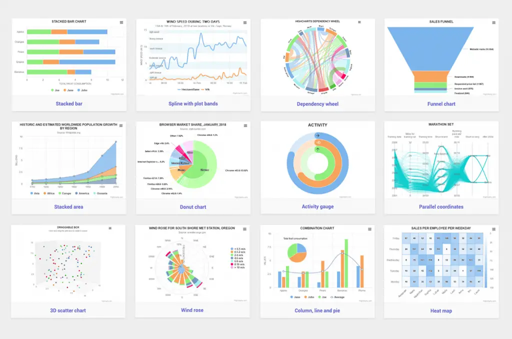
Key Types of Data Visualization Tools
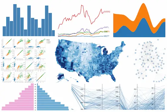
- Bar Graphs and Charts: These are some of the most commonly used visualization tools, used to represent data in a simple and straightforward manner. Examples include Matplotlib, ggplot2.
- Line Graphs: Line graphs are used to represent continuous data over time and are commonly used in stock market analysis, weather patterns, and other time-series data. Examples include Seaborn, Plotly.
- Scatter Plots: Scatter plots are used to represent the relationship between two sets of data and can be used to identify trends and patterns in the data. Examples include Bokeh, Vega-Lite, and Highcharts.
- Heat Maps: Heat maps are used to represent data in a matrix format and are commonly used to visualize large datasets and identify patterns and correlations. Examples include Chart.js, Google Charts.
- Map Visualizations: Map visualizations are used to represent geographical data and can be used to visualize data such as population density, climate patterns, and other spatial data. Examples include Kepler.gl, OpenLayers, and Mapbox.
- Interactive Visualizations: Interactive visualizations are used to create interactive charts and dashboards that allow users to interact with the data and explore it in greater detail. Examples include Tableau, PowerBI, and MATLAB.
Data Visualization Tools Features to Look For
- Customization options: The ability to adjust colors, labels, axis ranges, and other aspects of the visualization to suit your needs.
- Interactivity: The ability to zoom, pan, hover over data points, and otherwise interact with the visualization to gain insights.
- Import/export capabilities: The ability to import data from various sources, including spreadsheets and databases, and export the visualization in various formats, such as image files and interactive web pages.
- Multiple chart types: The availability of a variety of chart types, including bar charts, line charts, scatter plots, histograms, and more, to visualize different types of data.
- Ease of use: A user-friendly interface that allows you to create visualizations quickly and easily, without needing extensive technical skills.
- Data mapping: The ability to map data to geographical locations, providing a powerful way to visualize and analyze data with a geographic context.
- Data filtering: The ability to filter data based on specific criteria, such as date ranges, categorical values, or numeric ranges, to focus on the data that is most relevant to your visual analysis.
Benefits of Using Data Visualization Tools
- Improved Understanding: Visualizing data allows people to understand complex information quickly and easily.
- Easy Communication: Data visualizations serve as a universal language, making it easy for people with different backgrounds to communicate and understand data.
- Discover Insights: Data visualization tools can help discover trends, patterns, and relationships that may not be apparent from raw data.
- Better Decision Making: Data visualizations provide a clear and concise representation of information, making it easier for people to make informed decisions.
- Enhanced Presentation: Data visualizations can add depth and engagement to presentations and reports, making them more effective at communicating information.
- Increased Productivity: By reducing the time and effort required to manually analyze data, data visualization tools can help increase productivity.
- Improved Accuracy: Visualizing data reduces the risk of errors and can help identify errors quickly, leading to improved accuracy.
- Effective Monitoring: Data visualization tools provide real-time monitoring capabilities, allowing organizations to track key metrics and make data-driven decisions.
Final Thoughts
In conclusion, data visualization tools are an essential tool for researchers, allowing them to present their findings in an effective and engaging way. The 15 tools listed above represent some of the best options available, offering a wide range of features, capabilities, and customization options.
Whether you’re looking for a tool to perform data analysis, or a tool for creating professional-looking reports and presentations, there’s a tool on this list that will meet your needs.
When choosing a data visualization tool, it’s important to consider the type of data you’re working with, the goals you want to achieve, and the level of customization you require.
What have you used that works great for your organization?
Share your experience in the comment below!
Thanks for sharing the information. Continue doing this. Your Blog is very nice. Wish to see much more like this. Thanks for sharing your information Enjoyed reading the article above , really explains everything in detail, the article is very interesting and effective. Thank you and good luck in the upcoming articles
Thank you for the kind words!