
Is data presentation eating your time? Discover the best free graph design software in our blog post.
In the dynamic and data-rich realm of academia, data visualization frequently forms the cornerstone of understanding and dialogue.
It’s a means to untangle the complex strands of data and weave them into a narrative that not only makes sense but also engages and informs.
Traditional methods have long struggled to keep up with the sheer scale and variety of data that researchers encounter today. The remedy to this problem lies in the innovative and sophisticated realm of free graph design software.
Table of Contents
Overview
These tools aren’t just about beautifying graphs; they transform how we understand, interact with, and present data in academia.
The online tools provide capabilities that push the boundaries of traditional methods. With them, data becomes a vivid, dynamic landscape ready to be explored and shared. Now, let’s discover the features and benefits of these tools.
Free Graph Design Software
#1. Google Charts: Best for Web-based Data Visualization
Summary
- Web-based tool.
- Rich gallery of charts.
- Powerful customization.
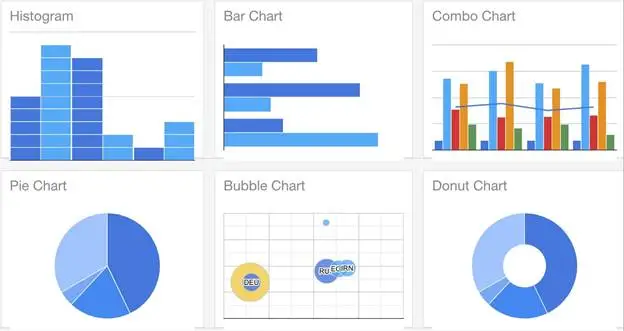
Google Charts is a suite of graphs and charts, ranging from humble pie charts to intricate tree maps. This is a revolution in web-based data visualization that empowers researchers.
What are the benefits of Google Charts?
- Easy Integration: Seamlessly integrates with web applications.
- Versatility: Caters to different levels of complexity in data visualization.
- Accessibility: Provides cross-browser compatibility and accessibility features.
With Google Charts at your fingertips, you can not only meet the evolving demands of data visualization in academia but also exceed them. It opens new realms of possibility and allows academics to paint the canvas of research data in vivid and insightful ways.
Source: https://developers.google.com
#2. Microsoft Excel Online: Best for Spreadsheet-based Graph Design
Summary
- Familiar interface.
- Diverse chart types.
- Online accessibility.
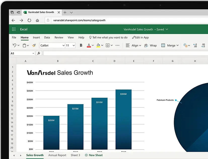
Microsoft Excel Online is a modern-day wizard that has taken the traditional magic of Excel and transported it into the cloud. This tool offers the familiarity and functionality of its desktop counterpart while adding the benefits of online collaboration and accessibility.
From the casual user to the advanced analyst, Excel Online has something for everyone, making it an indispensable tool in academia’s graph design arsenal.
What are the benefits of Microsoft Excel Online?
- Collaboration: Enables real-time collaboration on data analysis and visualization.
- Familiarity: Comes with a user-friendly interface that most academics are familiar with.
- Diversity: Provides an array of chart types, including histograms, scatter plots, and more.
Microsoft Excel Online takes the power of data visualization in academia and amplifies it, transforming the solitary act of data analysis into a collaborative journey.
With this tool, every academic can experience the convenience and power of cloud-based, spreadsheet graph design in a way that truly elevates their work.
Source: https://www.microsoft.com
#3. Tableau Public: Best for Interactive Data Visualization
Summary
- Interactive visualizations.
- Massive data handling capability.
- Sharing and publishing features.
Tableau Public transforms static data into an interactive performance. It handles voluminous datasets and offers the power to create engaging, interactive visualizations.
Tableau Public is the tool for academics who want to understand their data.
What are the benefits of Tableau Public?
- Interactivity: Creates dynamic and interactive visualizations to engage your audience.
- Scalability: Handles large datasets, ideal for intensive academic research.
- Publishing: Allows sharing and publishing of your visualizations online.
Tableau Public is more than a data visualization tool; it’s a stage where data performs and tells its own story. For academics, it opens up a world where data is something to be experienced, making every research presentation an engaging performance.
Source: https://www.tableau.com
#4. ChartGo: Best for Quick and Simple Chart Creation
Summary
- Quick and straightforward.
- No software download required.
- Variety of chart options.
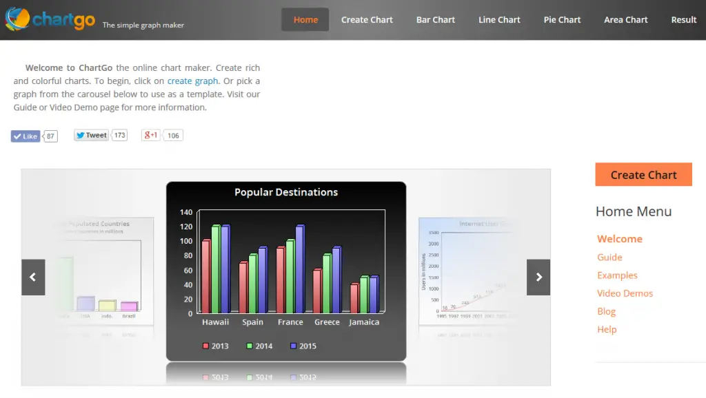
ChartGo is like the fastest runner on the data visualization track, known for its speed and simplicity. This tool offers a quick and easy solution for those in academia who need to create charts in a jiffy.
Whether you’re a student rushing to complete an assignment or a teacher looking to illustrate a point in class, ChartGo is your go-to solution.
What are the benefits of ChartGo?
- Speed: Quick and simple chart creation for immediate data visualization needs.
- Convenience: No software download or sign up required.
- Variety: Offers a broad range of chart types to fit different data sets.
ChartGo is the equivalent of having a fast, reliable pit crew in the race of academic data visualization.
It offers the speed and simplicity required to visualize data on the go while not compromising on the variety and quality of charts. With ChartGo, quick chart creation is just a few clicks away.
Source: https://www.chartgo.com
#5. Octave: Best for Numerical Computation and Visualization
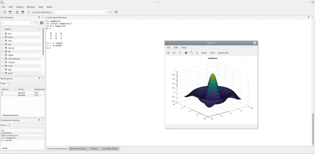
Summary
- Open-source software.
- High-level numerical computation.
- Excellent tool for visualizing mathematical models.
Octave stands as a trusted aide for academics involved in mathematics, engineering, and natural sciences.
It offers high-level numerical computation capabilities, akin to having a sophisticated calculator. The software also provides the capacity for visualizing these computations. This makes complex mathematical models more accessible and easier to understand.
What are the benefits of Octave?
- Open Source: Freely available to everyone and can be modified to suit specific requirements.
- Numerical Computation: Executes a wide variety of mathematical operations with precision.
- Visualizing Models: Allows visual representation of mathematical computations, enhancing comprehension.
Octave transforms the abstract world of mathematical computations into a tangible, visual realm. For academics involved in numeric heavy disciplines, Octave isn’t just a tool; it’s a game-changer.
Source: https://octave.org
#6. RAWGraphs: Best for Creating Complex Data Visualizations Easily
Summary
- User-friendly interface.
- Supports various chart types.
- Enables data mapping onto visual models.
Think of RAWGraphs as the master weaver of complex data narratives. It supports numerous chart types and helps academics easily map their data onto visual models.
Even without extensive knowledge of coding, users can harness the power of RAWGraphs to create stunning and complex visualizations.
What are the benefits of RAWGraphs?
- User-friendly: No need for advanced coding skills to generate sophisticated visualizations.
- Versatile: Supports numerous chart types to suit various data visualization needs.
- Data Mapping: Facilitates smooth mapping of data onto desired visual models.
RAWGraphs acts as a bridge, carrying academics over the chasm between complex data and its visual representation. It’s a tool that makes the intricate simple, bringing clarity to the academic world.
Source: https://www.rawgraphs.io
#7. ChartBlocks: Best for Non-technical Users Looking for Customization
Summary
- Easy to use.
- Customizable charts.
- Offers data import from various sources.
ChartBlocks is the friendly guide in the data visualization journey, especially for non-technical users in academia.
It’s a platform that doesn’t compromise on customization, allowing users to design charts that are as unique as the data they represent.
What are the benefits of ChartBlocks?
- User-friendly: Offers a straightforward and intuitive interface for non-technical users.
- Customizable: Allows users to create charts that reflect their unique data requirements.
- Data Import: Supports data import from various sources, including spreadsheets, databases, and live feeds.
ChartBlocks breaks down the technical barriers to data visualization, making the process more accessible to academics from all backgrounds. It proves that customization is not exclusive to tech wizards, but is indeed, for everyone.
Source: https://www.chartblocks.io
#8. Plotly: Best for Interactive Graphs and 3D Models

Summary
- Enables creation of complex, interactive plots.
- Provides 3D modeling functionality.
- Supports multiple programming languages.
Plotly is the architect of the data visualization domain, building interactive and 3D visual models with precision and style.
Its multi-language support and compatibility make it a popular choice for academics wanting to add a dynamic touch to their data presentations.
What are the benefits of Plotly?
- Interactivity: Creates dynamic plots that engage the audience.
- 3D Modeling: Provides options for 3D visualization, enhancing the complexity and depth of data representation.
- Language Support: Compatible with several programming languages, including Python, R, and JavaScript.
With Plotly, academia can move beyond the flatlands of traditional data visualization and into the vibrant, interactive 3D world.
Source: https://plotly.com
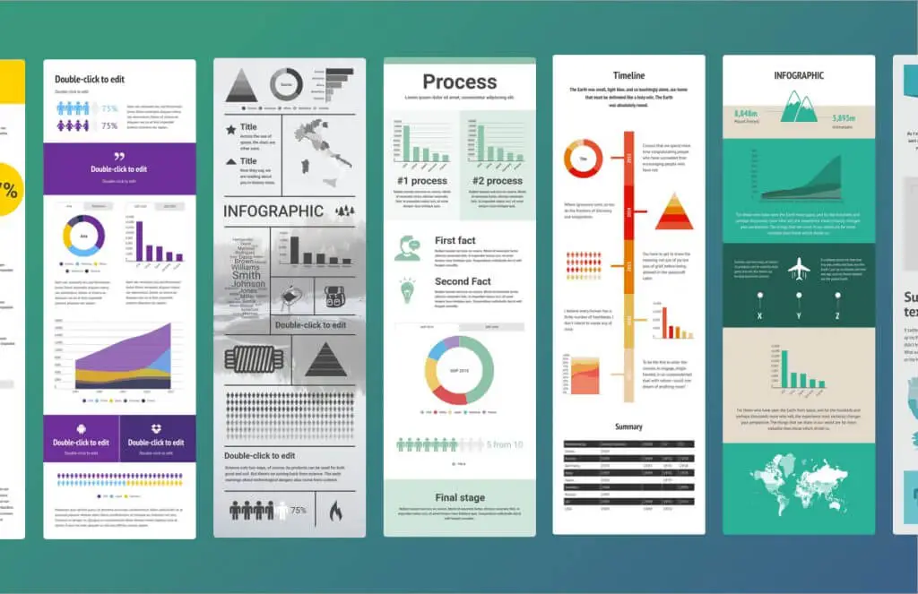
#9. Infogram: Best for Infographics and Reports
Summary
- Creates stunning infographics and reports.
- Offers a wide range of templates.
- Supports interactive elements.
Infogram is the storytelling genius of the data visualization arena. It excels in transforming cold, hard data into vibrant infographics and interactive reports.
What are the benefits of Infogram?
- Infographics: Helps create visually appealing data narratives through infographics.
- Templates: Offers a wide array of templates for reports and infographics.
- Interactivity: Enhances engagement through interactive elements.
Infogram turns data into compelling narratives, taking academic communication to a whole new level.
Source: https://infogram.com
#10. D3.js: Best for Custom and Interactive Web Visualizations
Summary
- JavaScript library for creating dynamic visualizations.
- High level of customizability.
- Allows interactivity in web browsers.
D3.js is the master puppeteer in the realm of data visualization, manipulating data and bringing it to life through custom and interactive web visualizations.
This JavaScript library provides academics with the freedom to present data in their own unique way, adding an interactive and dynamic layer to the web-based research presentations.
What are the benefits of D3.js?
- Customizability: Allows academics to design their unique data visualizations.
- Interactivity: Enhances engagement through interactive elements in web browsers.
- Dynamic Visualizations: Creates dynamic visualizations that update and animate in response to data changes.
With D3.js, data becomes more than numbers and charts; it becomes a dynamic entity that can interact with its audience. It’s a tool that lets data dance to the rhythm of the academic discourse.
Source: https://d3js.org
#11. FusionCharts: Best for Creating Interactive and Animated Charts in JavaScript
Summary
- Large library of charts and maps.
- Provides interactivity and animation.
- JavaScript based, supporting HTML5.
FusionCharts is like the choreographer of data, orchestrating interactive and animated charts in JavaScript.
Its extensive library, coupled with the capability for real-time data streaming, makes it an ideal tool for academics looking to make their data presentations more engaging and visually appealing.
What are the benefits of FusionCharts?
- Variety: Boasts a large library of charts and maps.
- Interactivity and Animation: Enhances data presentation through interactive and animated elements.
- Modern Tech: Uses JavaScript and supports HTML5, in sync with the latest web technologies.
FusionCharts brings the power of animation and interactivity to the academic world, making data presentations more lively and engaging. It’s a tool that enables data to take center stage and perform.
Source: https://www.fusioncharts.com
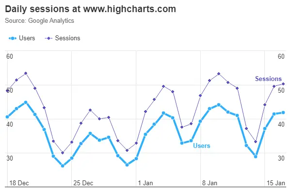
#12. Highcharts: Best for Real-time Data Streaming and Interaction
Summary
- Allows real-time data streaming.
- Supports interactive charts.
- Compatible with a variety of frameworks.
Highcharts is like a lightning-fast courier in the data visualization world, providing real-time data streaming and interaction.
Its compatibility with various frameworks makes it an essential tool in academia, where up-to-the-second data visualization can be critical for certain research fields.
What are the benefits of Highcharts?
- Real-time Data: Allows data to be streamed and visualized in real-time.
- Interactivity: Supports interactive charts for a more engaging presentation.
- Compatibility: Works seamlessly with a variety of web development frameworks.
Highcharts serves as a reliable partner in academia, where current, live data can provide key insights. It’s the express train of data visualization, delivering data at the speed of now.
Source: https://www.highcharts.com
#13. SigmaPlot: Best for Statistical Analysis Graphs
Summary
- Offers high-quality statistical analysis graphs.
- Provides data analysis functionality.
- Customizable charts.
SigmaPlot is the trusted advisor for academics in fields where statistical analysis is key. It doesn’t merely offer high-quality graphs; it also comes packed with data analysis functionality.
From simple 2D graphs to complex 3D models, SigmaPlot provides customizable solutions that cater to specific academic needs.
What are the benefits of SigmaPlot?
- Statistical Analysis: Designed specifically for creating high-quality statistical graphs.
- Data Analysis: Provides tools for carrying out thorough data analysis.
- Customization: Allows charts to be tailored to fit specific academic requirements.
SigmaPlot turns complex data into comprehensible visual narratives.
Source: https://systatsoftware.com
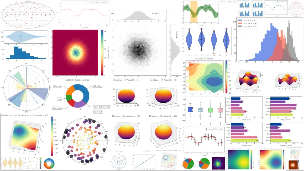
#14. Matplotlib: Best for Creating Static, Animated, and Interactive Plots in Python
Summary
- Python library for various plot types.
- Offers static, animated, and interactive plots.
- Provides customization options.
Matplotlib is a versatile artist in the realm of data visualization. As a Python library, it caters to a wide array of academic needs, from static and animated plots to interactive ones.
Whether you’re sketching a quick scatter plot or crafting a complex animated visualization, Matplotlib is there to bring your data to life.
What are the benefits of Matplotlib?
- Versatility: Supports the creation of diverse plot types.
- Dynamic and Interactive: Offers animated and interactive plots to enhance data presentation.
- Customization: Allows tweaking of visualizations to fit specific academic needs.
Matplotlib is the Swiss army knife of data visualization in Python, offering a tool for every occasion. It transforms the way academics present data, making it more dynamic, engaging, and comprehensible.
Source: https://matplotlib.org
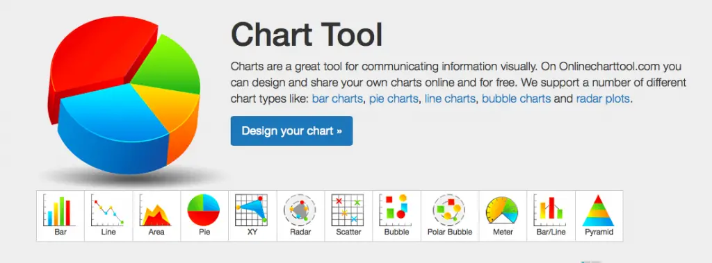
#15. OnlineChartTool: Best for Basic, User-friendly Chart Design
Summary
- Easy-to-use interface.
- Supports various basic chart types.
- Allows exporting in different formats.
OnlineChartTool is your friendly neighbor in the world of data visualization, ideal for creating basic, easy-to-understand charts. Its user-friendly interface and broad range of export options make it a breeze for academia to craft and share clear, concise visual data narratives.
What are the benefits of OnlineChartTool?
- Ease of Use: Its straightforward interface is perfect for beginners.
- Versatility: Supports a variety of basic chart types.
- Export Options: Provides various export options for ease of sharing and presenting.
OnlineChartTool takes the guesswork out of data visualization, providing a straightforward way for academia to present data. It’s the ideal tool for those seeking simplicity without sacrificing clarity.
Source: https://www.chartle.com
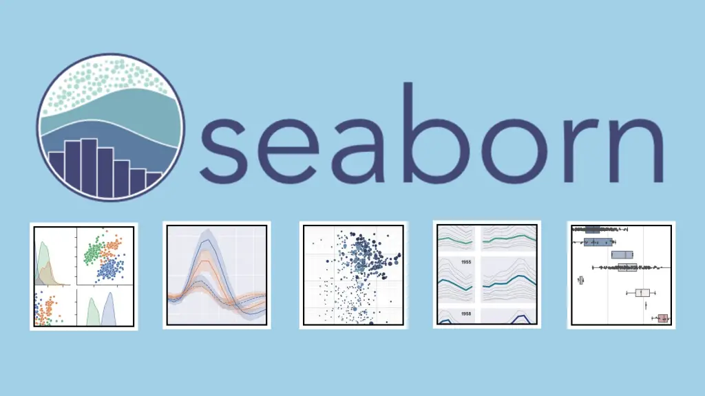
#16. Seaborn: Best for Statistical Graphics in Python
Summary
- Python library for creating statistical graphics.
- Built over Matplotlib.
- Provides a high-level interface.
Seaborn is like a polished linguist, helping academia articulate statistical data in a visual language that’s easy to understand. As a Python library built over Matplotlib, it provides a high-level interface for creating attractive and informative statistical graphics.
What are the benefits of Seaborn?
- Statistical Focus: Specializes in creating statistical graphics.
- High-level Interface: Simplifies the process of generating complex statistical visualizations.
- Integration: Integrates seamlessly with Python data structures.
Seaborn is a tool that translates the complex language of statistics into visually engaging narratives.
Source: https://seaborn.pydata.org
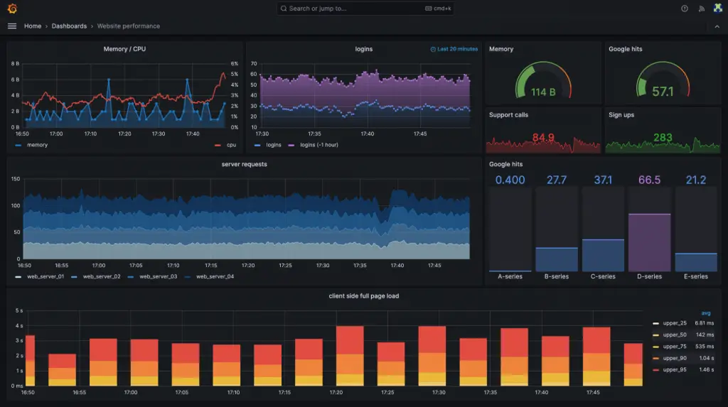
#17. Grafana: Best for Time-series Data Visualization
Summary
- Supports time-series data visualization.
- Enables real-time monitoring.
- Highly customizable dashboards.
Grafana is that seasoned time-traveler, adept at visualizing time-series data with precision and flair. It’s customizable dashboards make it a powerful tool for insightful data representation.
What are the benefits of Grafana?
- Time-series Visualization: Expertly handles visualization of time-oriented data.
- Real-time Monitoring: Enables continuous tracking of data over time.
- Customizable Dashboards: Offers personalized views of data based on individual requirements.
Grafana makes time an ally in the world of data visualization, aiding academia in making key temporal insights. It’s the tool that lets data unveil its story, one moment at a time.
Source: https://grafana.com
#18. LiveGap Charts: Best for Quick Online Creation of Various Chart Types
Summary
- Enables quick and easy chart creation.
- Supports a variety of chart types.
- Offers online and offline functionality.
LiveGap Charts is the quick-draw artist in the wild west of data visualization, perfect for those who need to whip up various types of charts in a hurry. This handy tool, with its dual online and offline functionality, is ideal for academics who value both speed and flexibility.
What are the benefits of LiveGap?
- Quick Creation: Provides a swift, straightforward method to create charts.
- Variety: Supports a wide array of chart types for various data visualization needs.
- Dual Functionality: Offers both online and offline modes for convenience.
LiveGap Charts is the reliable sidekick for academia, offering fast and easy visualization solutions. It’s the express lane to data visualization, making chart creation a breeze.
Source: https://charts.livegap.com
#19. Datawrapper: Best for Creating Interactive Charts and Maps without Coding
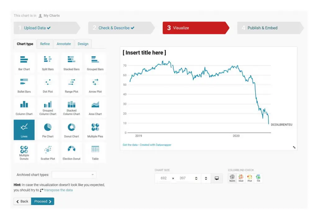
Summary
- Allows creation of interactive charts and maps.
- Doesn’t require coding skills.
- Provides data uploading and formatting features.
Datawrapper is like a skilled translator in the world of data visualization, converting raw data into interactive charts and maps without the need for coding. Its easy-to-use features make it an excellent tool for academics who prefer to focus on their research rather than wrangling with code.
What are the benefits of Datawrapper?
- Interactivity: Offers creation of engaging interactive charts and maps.
- No Coding Required: Simplifies data visualization for non-coders.
- Data Management: Provides features for easy data uploading and formatting.
Datawrapper is the go-to tool for those in academia who want to create interactive visualizations without delving into code. It’s the key that unlocks the door to effortless, coding-free data visualization.
Source: https://www.datawrapper.de
#20. ZingChart: Best for Large Datasets and Big Data Visualization
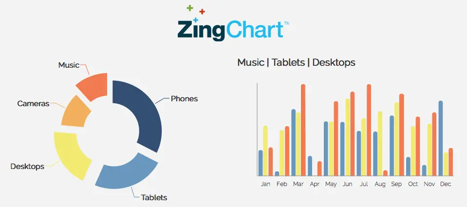
Summary
- Specializes in visualizing large datasets.
- Supports big data visualization.
- Offers a vast array of chart types.
ZingChart is the Hercules of data visualization, handling large datasets and big data visualization with ease. Its robustness and broad range of chart types make it a powerful tool for academia, particularly in research fields where big data is king.
What are the benefits of ZingChart?
- Large Datasets: Excellently handles visualization of large datasets.
- Big Data Visualization: Specializes in big data visualization for deeper insights.
- Chart Variety: Provides a vast selection of chart types to cater to different academic needs.
For academia swimming in the deep end of big data, ZingChart is a lifeline. It’s the tool that tames the big data beast, transforming it into insightful, manageable visual narratives.
Source: https://www.zingchart.com
#21. Bokeh: Best for Interactive Data Visualization in Python
Summary
- Python library for interactive visualizations.
- Supports various chart types.
- Highly customizable.
With its diverse chart types and high customization options, this Python library is an academic’s secret weapon for bringing static data to vibrant life.
What are the benefits of Bokeh?
- Interactivity: Specializes in creating engaging, interactive visualizations.
- Versatility: Supports a wide range of chart types for various data presentation needs.
- Customization: Allows tweaking of visualizations to meet unique academic requirements.
With Bokeh, academic data visualization becomes a lively puppet show, with each data point dancing to your tune. It’s the tool that lets your data take center stage, captivating your audience.
Source: https://bokeh.org
#22. Amcharts: Best for Advanced Chart Types and Maps
Summary
- Supports advanced chart types and maps.
- Comes with numerous pre-built examples.
- Provides a wide range of customization options.
Amcharts is like a seasoned explorer, navigating the complex terrain of advanced chart types and maps with ease. This tool, with its wealth of pre-built examples and customization options, is an academic’s trusted guide in the journey of data visualization.
What are the benefits of Amcharts?
- Advanced Charts: Supports creation of complex chart types and maps.
- Pre-built Examples: Offers numerous pre-constructed charts for quick start.
- Customization: Provides a vast array of customization options for unique visualizations.
Amcharts empowers academia to push the boundaries of data visualization, uncovering deeper insights from their data. It’s the tool that takes you on an adventure into the depths of your data.
Source: https://www.amcharts.com
#23. Dygraphs: Best for Large and Streaming Data Sets
Summary
- Specializes in large and streaming data sets.
- Provides interactive zoom and pan features.
- Offers customizable chart types.
Dygraphs effortlessly handles large data sets. With interactive zoom and pan features, and customizable chart types, this tool is an essential companion in academia where managing voluminous data is a common task.
What are the benefits of Dygraphs?
- Large Data Sets: Expertly handles visualization of large and streaming data sets.
- Interactive Features: Provides zoom and pan features for interactive data exploration.
- Customization: Offers customizable chart types to cater to individual academic needs.
Dygraphs brings a sense of order and clarity to the chaotic world of large data sets, making it an invaluable tool in academia. It’s the tool that helps you juggle massive amounts of data with ease and precision.
Source: https://dygraphs.com
#24. CanvasJS: Best for Responsive HTML5 Charts
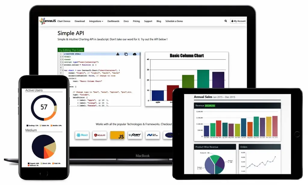
Summary
- Produces responsive HTML5 charts.
- Offers a variety of chart types.
- Has excellent documentation and support.
CanvasJS is like a skillful artist, rendering responsive HTML5 charts with an impressive range of chart types. Its excellent documentation and support make it a go-to tool in academia, where precision and clarity are of the essence.
What are the benefits of CanvasJS?
- Responsive Charts: Crafts charts that adjust seamlessly to various screen sizes.
- Variety: Provides an array of chart types for various data visualization needs.
- Support: Offers thorough documentation and robust support to guide users.
CanvasJS makes data visualization a fine art in academia, painting a vivid picture of information that is both responsive and intuitive. It’s the tool that puts the ‘art’ in ‘chart’.
Source: https://canvasjs.com
#25. Chartist.js: Best for Responsive Charts
Summary
- Specializes in creating responsive charts.
- Offers a simple, flexible API.
- Customizable to meet specific needs.
Chartist.js boasts a simple, flexible API and high customization options. This tool is an excellent choice for academia where responsive data visualization is a priority.
What are the benefits of Chartist.js?
- Responsiveness: Specializes in creating charts that adjust to various screen sizes.
- Simplicity: Provides a simple and flexible API for ease of use.
- Customization: Allows high levels of customization to meet unique academic requirements.
Chartist.js offers flexibility and adaptability in data visualization, making it an essential tool in academia. It’s the tool that brings your data to life, no matter where or how it’s viewed.
Source: https://gionkunz.github.io
#26. JFreeChart: Best for Scientific Data Representation
Summary
- Suited for scientific data representation.
- Supports a broad spectrum of chart types.
- Provides a well-documented API.
JFreeChart is like a learned professor, specializing in the precise representation of scientific data.
Its extensive range of chart types and well-documented API make it a trusted companion in academia, particularly in scientific research disciplines.
What are the benefits of JFreeChart?
- Scientific Data: Ideally suited for visualizing scientific data.
- Chart Variety: Supports a broad array of chart types.
- Well-documented API: Makes it easy to learn and use the tool effectively.
JFreeChart elevates the communication of scientific data, transforming complex information into digestible visual narratives. It’s the tool that puts the ‘science’ in ‘data science’.
Source: https://www.jfree.org
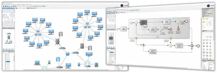
#27. yEd Graph Editor: Best for Flowcharts and Network Diagrams
Summary
- Specializes in flowcharts and network diagrams.
- Offers a user-friendly interface.
- Provides a wide range of layout algorithms.
yEd Graph Editor is like an artistic architect, excelling in the creation of flowcharts and network diagrams.
With its user-friendly interface and extensive layout algorithms, this tool is an invaluable asset for academics in fields that require visual representations of complex relationships and structures.
What are the benefits of yEd Graph Editor?
- Flowchart and Network Expertise: Specializes in creating detailed flowcharts and network diagrams.
- User-Friendly Interface: Offers an intuitive and easy-to-use interface.
- Layout Algorithms: Provides a wide range of layout algorithms for optimal diagram presentation.
yEd Graph Editor transforms complex relationships into visually captivating representations, making it an indispensable tool for academia. It’s the tool that helps you map out the intricate connections within your research.
Source: https://www.yworks.com
#28. ApexCharts: Best for Interactive Charts
Summary
- Creates interactive charts.
- Supports a wide range of chart types.
- Offers extensive customization options.
ApexCharts is like a conductor, orchestrating interactive symphonies of data visualization. With support for various chart types and a plethora of customization options, this tool empowers academics to create visually stunning and engaging interactive charts.
What are the benefits of ApexCharts?
- Interactivity: Allows the creation of interactive charts that engage the audience.
- Chart Variety: Supports a wide range of chart types to cater to different data presentation needs.
- Customization: Provides extensive options to customize the appearance and behavior of charts.
ApexCharts turns static data into a dynamic, interactive experience, captivating audiences and fostering a deeper understanding of the data. It’s the tool that transforms your charts into captivating performances.
Source: https://apexcharts.com
#29. TauCharts: Best for Customizable and Interactive Data Visualization
Summary
- Offers customizable and interactive data visualization.
- Provides advanced data exploration features.
- Supports various chart types.
TauCharts is like a versatile chameleon, adapting to the specific needs of academics through customizable and interactive data visualization.
With its advanced data exploration features and support for various chart types, this tool empowers researchers to uncover hidden insights in their data.
What are the benefits of TauCharts?
- Customizability: Allows customization of visualizations to meet specific academic requirements.
- Data Exploration: Provides advanced features for in-depth data exploration and analysis.
- Chart Variety: Supports a wide range of chart types for flexible data visualization.
TauCharts opens a world of endless possibilities in academia, enabling researchers to delve into their data and extract valuable insights.
Source: https://taucharts.com
#30. Vis.js: Best for Dynamic, Browser-Based Visualization

Summary
- Facilitates dynamic, browser-based visualization.
- Supports interactive and customizable visualizations.
- Offers compatibility with modern web technologies.
Vis.js is like a virtuoso performer, enchanting audiences with its dynamic, browser-based visualizations.
With its interactive and customizable features, this tool empowers academics to create engaging and informative visualizations that seamlessly integrate with modern web technologies.
What are the benefits of Vis.js?
- Dynamic Visualization: Enables the creation of dynamic, interactive visualizations.
- Customization: Provides extensive options for customizing visualizations.
- Compatibility: Works seamlessly with modern web technologies for easy integration.
Vis.js takes data visualization in academia to new heights, offering a platform for captivating, browser-based visual narratives. It’s the tool that brings your data to life in the dynamic world of the web.
Source: https://visjs.org
Conclusion
In the electrifying domain of academia, free graph design software evolves raw data into spellbinding narratives, much like its parallel, free graphic design software, which takes simple ideas and morphs them into visually striking designs.
Both platforms empower researchers, students, and even graphic designers to unleash their creativity and turn complicated information into eye-catching visual narratives.
Free graph design software shapes the path for impactful communication, allowing academic minds to present their findings with unrivaled clarity and artistic elegance.
In a similar vein, the best free graphic design tools offer an array of advanced features and user-friendly interfaces, proving themselves as invaluable assets for creating visually compelling content.
Comparing the two, free graphic design software, like the adored Adobe Illustrator, tends to focus more on crafting detailed vector graphics, while free graph design software emphasizes data visualization. However, both provide a broad selection of free templates, eliminating a large portion of the learning curve for beginners.
This allows users to start designing right away, even if they’re not quite ready to dive into the more advanced tools offered.
Nevertheless, it’s essential to acknowledge that the best graphic design software may come with a steeper learning curve, especially if it houses more advanced features, as is the case with Adobe Illustrator. While this may be the case, the rewards for mastering these platforms are undeniable.
Whether one opts for a free graph design software or a free graphic design tool, the objective remains the same: to transform complex ideas into visually stunning narratives.
While these platforms may differ in their approaches and specific tools, their shared goal is to enhance communication by making information more digestible and engaging, with the end game of creating a profound impact on their audiences.